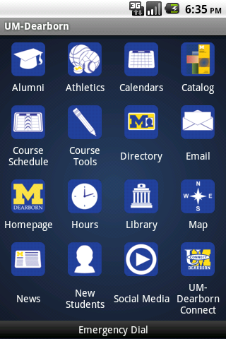
 The main screen of the application consists of 16 buttons arranged in 4 rows by 4 columns.
This is the last version of the app developed before being given to the University of Michigan-Dearborn; it is not endorsed or supported by the University. Please check the Google Play Store for an officially released version. The University of Michigan retains all respective copyrights, trademarks, and patents.
THIS SOFTWARE IS PROVIDED "AS IS" AND ANY EXPRESS OR IMPLIED WARRANTIES, INCLUDING, BUT NOT LIMITED TO, THE IMPLIED WARRANTIES OF FITNESS FOR A PARTICULAR PURPOSE ARE DISCLAIMED. IN NO EVENT SHALL THE DISTRIBUTOR BE LIABLE FOR ANY DIRECT, INDIRECT, INCIDENTAL, SPECIAL, EXEMPLARY, OR CONSEQUENTIAL DAMAGES (INCLUDING, BUT NOT LIMITED TO, PROCUREMENT OF SUBSTITUTE GOODS OR SERVICES; LOSS OF USE, DATA, OR PROFITS; OR BUSINESS INTERRUPTION) HOWEVER CAUSED AND ON ANY THEORY OF LIABILITY, WHETHER IN CONTRACT, STRICT LIABILITY, OR TORT (INCLUDING NEGLIGENCE OR OTHERWISE) ARISING IN ANY WAY OUT OF THE USE OF THIS SOFTWARE, EVEN IF ADVISED OF THE POSSIBILITY OF SUCH DAMAGE.
Download Mobile UM-Dearborn Android AppThis application was designed and developed as part of a two-semester Senior Design Seminar course beginning in . Six students (Cardi DeMonaco Jr., Michael Girard, Randy Foster, David Supplee, Tony Tahmouch, and Trevor Tabaka) worked with representatives of the University of Michigan-Dearborn to create a mobile application with the intent that it be used officially by the University. The goals of the project, as described by a University representative, were as follows:
Based on an informal survey, two editions of the application were developed: one for Android and one for iOS (i.e. iPhone). The features of the application are the same for both editions. Unless otherwise noted, this article will contain examples from the Android version.
The main screen of the application consists of 16 buttons arranged in 4 rows by 4 columns.The main interface of the application consists of a set of 16 tiled buttons - a design borrowed from the user interface used on both Android and iOS. Reusing an interface that is familiar to the user reduces the time spent orienting and thus increases usability. In addition to a pictorial representation, each button is also labeled using text. The combination of button placement, icon, and text act as markers for users. These markers help users form a mental map of the screen and quickly locate icons during subsequent uses.
The small screen size of the target devices influenced the design of the icons. It was important that the icons were large enough to differentiate, yet still small enough to fit the desired number on the screen at once. Where possible, icon sizes were referenced from official guidelines.
All icons were created as vector drawings in Inkscape. Vector drawings allow for infinite scaling of the graphic without a loss in quality, which is useful for high resolution screens and print or other mediums. A simple theme of solid flat colors was used for consistency between the icons, and all icons share the same solid blue background.
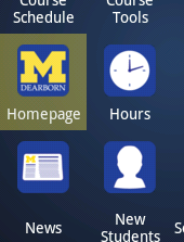 Visual feedback, such as highlighting around a button, helps the user navigate the interface.
Multiple input methods exist for the target devices, and care was taken to ensure that each performed in an acceptable manner. Touch-based input benefited from large buttons with adequate margins that provide ample space for finger presses. Multitouch gestures are enabled on supported devices. Trackball and keypad input take advantage of visual feedback on an unobscured screen.
Visual feedback was used wherever possible to respond to user actions. As mentioned before, buttons have highlighting when focused and when pressed. Animated loading dialogs are used when the application performs network requests. Errors or warnings are displayed in popup dialogs that contain understandable explanations. Dialog windows contain unambiguous options for user input and menu items change based on context.
The features selected for the application were the result of research of other university applications, brainstorming with University of Michigan-Dearborn representatives, and suggestions given by others. The team spent time trying out features from over a dozen other university applications and reading user reviews for useful features or complaints. Early meetings with University representatives were vital for gathering requirements from the standpoint of the University. As the application ultimately belonged to the University, these requirements took precedence over others. Lastly, team members and colleagues offered suggestions from student and faculty perspectives.
 The University of Michigan-Dearborn news feed is displayed using a ListView, a native GUI element.
As the research showed, the majority of the useful features in a mobile university application were reiterations of information that could be found on a university web site. However, the advantage of an application was in collecting and presenting this same information in a format more suited to a mobile device. Using the native graphical user interface elements of the device went a long way in improving the overall aesthetic of the information. Mobile versions of web pages were a satisfactory substitute when native elements could not be applied. For this application, many of the features are an implementation of this method.
The University of Michigan-Dearborn news articles, library book search, new book list, and campus map all benefited from using native graphical user interface elements. Many of the social media pages and the athletics pages use mobile versions. Although the remaining pages were not able to be reformatted, they contained important information and were still useful to include as quick links. The Android edition takes advantage of Intents to open links in the user's preferred web browser. Thus, all pages have the ability to save the user's login credentials securely.
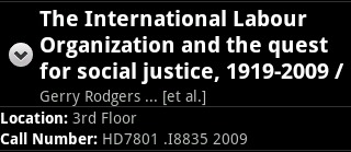 A library book can easily be located by call number.
Mobile devices allow more than just reformatting information for the user. There were several tasks that were greatly improved when ported to a mobile phone platform. The most obvious advantage was being able to access information wherever the user is. For instance, the user can use the library feature of the application to find a book and locate it in the library by its call number. Also, any phone number displayed in the application (whether it is part of the application or part of a web site) can be dialed directly. The addition of hardware such as a GPS receiver allows for a much more feature rich campus map, which is described in detail below.
 An interactive map of campus. The menu in the lower half of the image is normally hidden.
The campus map contains a set of features that could only be performed on a mobile device. The application uses the device's GPS receiver to show where the user is on the map. If the user is not on campus, he or she can get driving directions to campus. The Android edition uses Google Maps Navigation for turn-by-turn directions and traffic information. In addition to showing the user his or her current location, the GPS receiver can be used to mark and later find a parked car. A special icon on the map appears where the parked vehicle is.
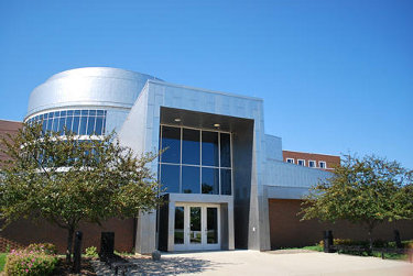 Dozens of photographs of locations and points of interest on campus were taken for the application.
The map is very useful for new students, visiting faculty, or someone else not familiar with campus. Users can see a list of all buildings on campus ordered alphabetically and select one to highlight it on the map. Each of the buildings on the map is outlined and labeled with its abbreviation, making it easy to see where things are in relation to one another. More information about each building, including an outdoor photograph appear when a building outline is tapped.
The map also has a series of layers that can be toggled on to see more information. The location of the campus shuttle stops are denoted by their own special icons. Selecting one of these icons shows a photograph of the shuttle stop and days and times of operation. Also available in a separate layer are many sculptures, art pieces, and other points of interest on campus. Selecting one of these items will display a photograph of it.
One of the most important nonfunctional requirements for the application was maintainability. A team goal was to develop a way to remotely send updates to users; then, users would not have to redownload the entire application when a minor change was made. The team also wanted to design this system so that from a maintainer's perspective, even a non-technical person could be in charge of making changes.
In the end, the team designed the update system to use XML files that could be placed on any public-facing web server. Changes to the application can be made by modifying tags in a text editor and transferred to the server using a FTP client. The design of the system creates flexibility for the maintainers; they can choose to delegate application changes to others with minimal training.
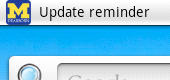 A notification reminder is sent to the user if an update is available.
On the application side, special consideration was made to make the service as unobtrusive as possible. From the user's perspective, he or she is unaware that the application is checking for updates unless one is actually found. Multithreading was used to allow the application to load and be fully usable while a background thread checks for updates (a splash screen is used on iOS). The user is able to cancel an update and continue using the application without any further interruptions. When the application is closed, a notification is sent to the user reminding them that an update is available.
The three goals of the project were met and the completed project was signed over to the University of Michigan in . Both the Android and iOS editions of the application were created, and the team shared as many resources as possible to reduce development time. Icons, photographs, the update service, and the library new book list were all able to be used for both platforms. Features like the interactive campus map, parking reminder, emergency dial, library new book list, special calendars and additional links to resources provide services beyond the University website. These features - along with the reformatting and presentation of information in a mobile-friendly format - could only be provided by creating an application.
The appeal of the application is evident in over 100 downloads for the preview version that spread solely by word of mouth. From those downloads, the application has been used more than 1500 times. The preview version has been used by students and faculty alike, and has impressed the latter so much that faculty of the College of Engineering and Computer Science have volunteered to take over the project on behalf of the University.